Foundations
- Logos
- Color
- Gradients
- Typography
- Iconography
Logos
Note: The tagline version of the logo should only be used in cases where the tagline is large enough to be legible. In all other cases, the standard version, without tagline, should be used.
Primary Logo/Logo + Tagline


White Logo/White Logo + Tagline


Logomark

Color
Brand
Virtru Blue
#004987
var(--virtru-blue)
Contrast Test
Pass
Pass
Fail
Fail
Fail
Fail
Dark Blue
#001E4A
var(--dark-blue)
Contrast Test
Pass
Pass
Fail
Fail
Fail
Fail
Control Bar Blue
#6AAAE4
var(--control-bar-blue)
Contrast Test
Fail
Fail
Fail
Pass
Fail
Fail
Light Blue
#92C0E9
var(--light-blue)
Contrast Test
Fail
Fail
Fail
Pass
Fail
Pass
Lightest Blue
#C2D5ED
var(--lightest-blue)
Contrast Test
Fail
Fail
Pass
Pass
Fail
Pass
Neutral
Dark Gray
#2D323B
var(--dark-gray)
Contrast Test
Pass
Pass
Fail
Fail
Fail
Fail
Light Gray
#636469
var(--light-gray)
Contrast Test
Pass
Pass
Fail
Fail
Fail
Fail
Secondary & Feedback
Light Green
#6ABF4B
var(--light-green)
This color is strictyly used for messages indicating success. Utilize black on top of a Light Green background.
Contrast Test
Fail
Fail
Pass
Pass
Dark Red
#9F2241
var(--light-green)
This color is strictyly used for messages indicating an error. Utilize Dark Red on top of a white background, or white on top of a Dark Red background.
Contrast Test
Pass
Pass
Fail
Fail
Light Yellow
#FFC629
var(--light-yellow)
This color is used in very specific cases to draw attention to elements or text. It can be seen on the homepage and solutions pages. This color is used very sparingly, if attention to important pieces is not achievable with standard colors.
Contrast Test
Fail
Fail
Pass
Pass
Pass
Pass
Gradients
Gradient 1
Use white as the font color and white buttons against this gradient.
Gradient 2
Use white as the font color and white buttons against this gradient.
Gradient 3
Use Virtru Blue as the font color and primary buttons against this gradient.
Gradient 4
Use white as the font color and white buttons against this gradient.
Gradient 5
Use Virtru Blue as the font color and primary buttons against this gradient.
Gradient 6
Use Virtru Blue as the font color and primary buttons against this gradient.
Gradient 7
Use white as the font color and white buttons against this gradient.
Gradient 8
Use white as the font color and white buttons against this gradient.
Gradient 9
Use white as the font color and white buttons against this gradient.
Gradient 10
Use white as the font color and white buttons against this gradient.
Gradient 11
Use white as the font color and white buttons against this gradient.
Gradient 12
Use white as the font color and white buttons against this gradient.
Gradient 13
Use white as the font color and white buttons against this gradient.
Typography
This is Adelle,
Our heading typeface.
This is Barlow,
Our body typeface.
Desktop Break
Mobile Break
Heading One
Heading One
3rem/2rem - Adelle
Heading Two
Heading Two
2rem/1.5rem - Adelle
Heading Three
Heading Three
1.25rem/1.125rem - Barlow
Heading Four
Heading Four
1.125rem/1rem - Barlow
Heading Five
Heading Five
1.125rem/1rem - Barlow
Heading Six
Heading Six
0.875rem/0.875rem - Barlow
Subtitle
Subtitle
1.25rem/1.25rem - Barlow
Body Bold
Body Bold
1rem/1rem - Barlow
Body
Body
1rem/1rem - Barlow
Link Link1rem/1rem - Barlow
V-Accordion 1
This is our main accordion. It is used to break down 3 or more bullet points, while keeping the page a little cleaner.

V-Awards Banner
This is a static module containing various awars banners, including FIPS Validated and a 3x with Cybersecurity Breakthrough Award, Inc Power Partner, and G2 Top 50.
Virtru for Outlook is FIPS Validated:
Helps support advanced security requirements mandated by certain regulatory obligations, including CMMC and ITAR

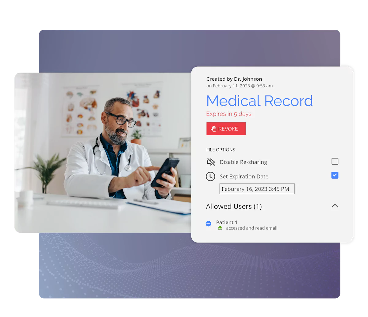
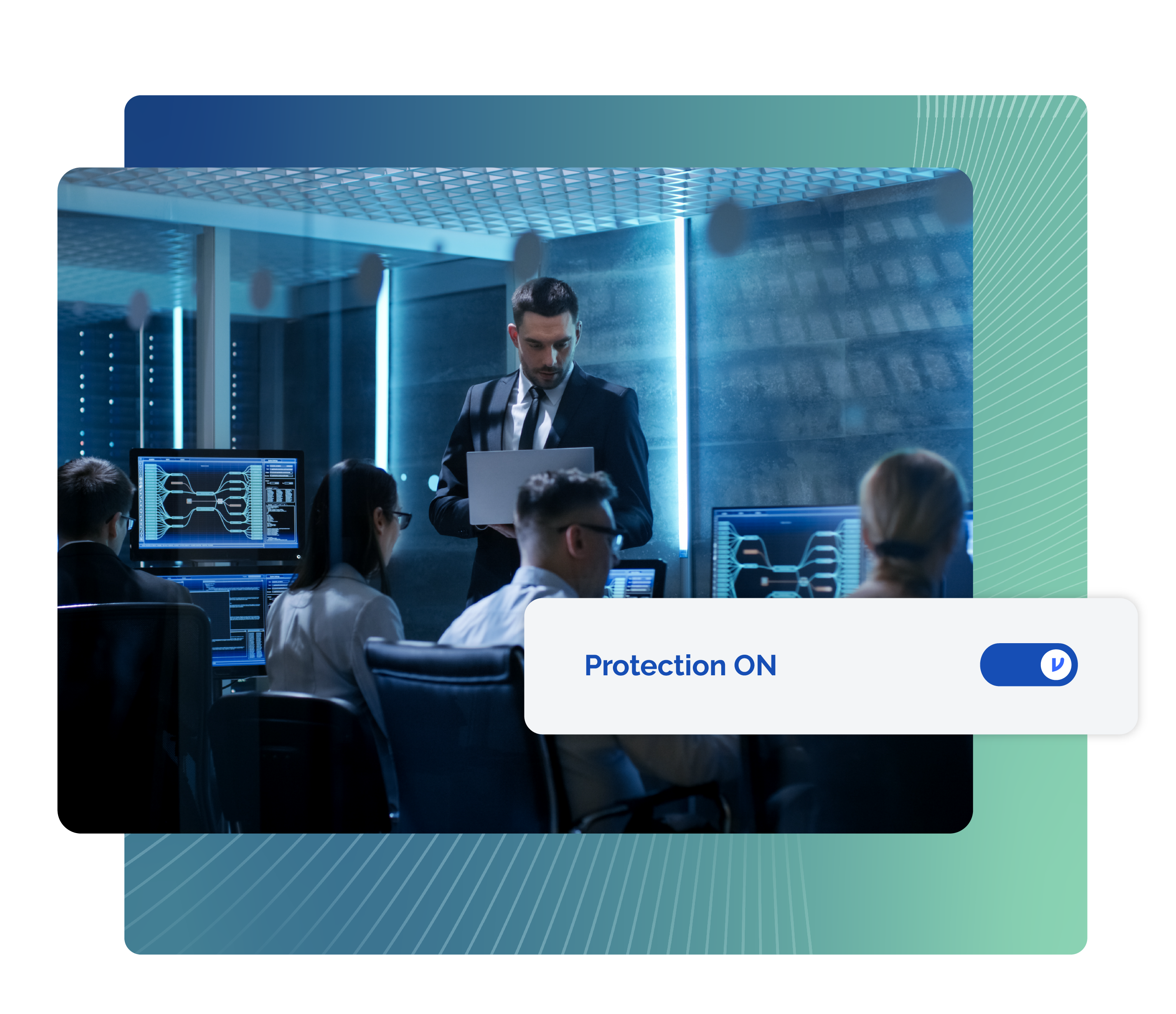
V-Banner 1
This is a dynamic banner that allows for an image, heading, and rich text block. The background is static. If you use an image, keep it simple. The rich text block allows for the addition of a button or link. A white button type is recommended.
Buttons
V-CTA Block
This is our main cta block, which has a heading, subtext, cta, and the ability to add logo below. There is no rich text block, to keep styling consistent. Most pages use this as a "book a demo" cta.
6,100 CUSTOMERS TRUST VIRTRU FOR DATA SECURITY AND PRIVACY PROTECTION.


"This is a quote banner, used for VVOC content. It requires an image, body text (quote), and name. Logo, title, and cta are optional."
Connor Byram
Frontend Developer, Virtru
V-Video Belt
This is a video belt module. It allows for a direct link to a Hubspot asset or an embed. A thumbnail image is required if a file is used.
Video Title
V-Cards 1
Basic Info
These cards are very basic and only contain the ability to add and edit copy in static text boxes.
Design
The headings and bodies will be based off of the tallest cards. This is to keep consistency in the design.
Use Cases
This would be a good module to use to outline value props, bullet points, or other semi text-heavy treatments that do not require imagery. If you need images, links/ctas, or more than 3 cards, there are other card modules to fit those needs.
Amount
Unlimited cards may be added to this module, though it is designed to look best with 3. Cards with wrap beyond 3. At 1258px, it will file to 1 card per row.
V-Cards 2
This is similar to V-Cards 1, but more robust.
Basic Info
Each card has a header section that includes a heading and a subhead.
You can also add an additional text body here, which is a rich text block
How it's Used
Design
Headings and bodies are based on the tallest card, to maintain consistency.
You can have a subheading, without the Rich Text
Amount
This module has a 3 card minimum and maximum.
You also do not need a link. There is a toggle in the CMS to get rid of the link.
Heading
Heading
Lorem ipsum dolor sit amet, consectetur adipiscing elit, sed do eiusmod tempor incididunt ut labore et dolore magna aliqua. Ut enim ad minim veniam, quis nostrud exercitation ullamco laboris nisi ut aliquip ex ea commodo consequat.
Heading
Lorem ipsum dolor sit amet, consectetur adipiscing elit, sed do eiusmod tempor incididunt ut labore et dolore magna aliqua. Ut enim ad minim veniam, quis nostrud exercitation ullamco laboris nisi ut aliquip ex ea commodo consequat.
Heading
Lorem ipsum dolor sit amet, consectetur adipiscing elit, sed do eiusmod tempor incididunt ut labore et dolore magna aliqua. Ut enim ad minim veniam, quis nostrud exercitation ullamco laboris nisi ut aliquip ex ea commodo consequat.